
Soft Meadows Organic Lavender Farm
SERVICES: branding, illustration, eco-friendly packaging, marketing collateral, photo editing
BRAND FEEL: relaxing, supportive, heart-centered, mystical, nurturing, elegant, pure
PROJECT GOAL: create a brand that feels like home & portrays a nurturing lavender farm that sells high-quality self-care products that nourish families, local community & the Earth


Design & Strategy
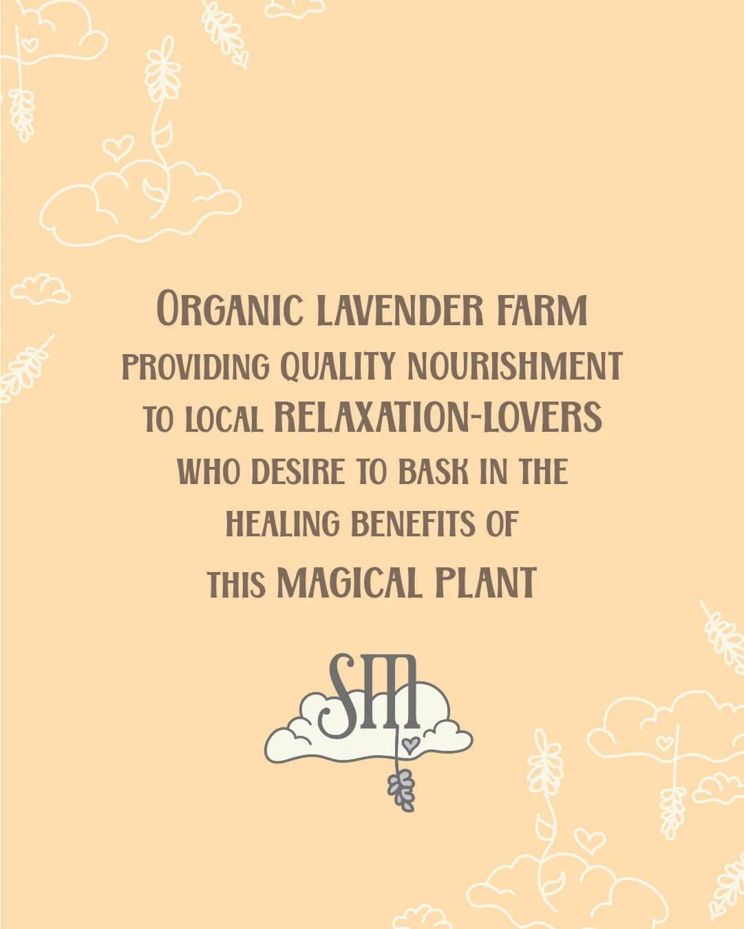
When creating the identity for Soft Meadows, I paired a magical-looking font with a playful one to communicate a nurturing + family-friendly apothecary feel.
This brand is carefully crafted to appeal to & resonate with mystical farm mamas who live in the nearby mountains and desire to bring hand-crafted, non-toxic + locally-grown botanical products home to their families for nurturing, soothing & relaxation.
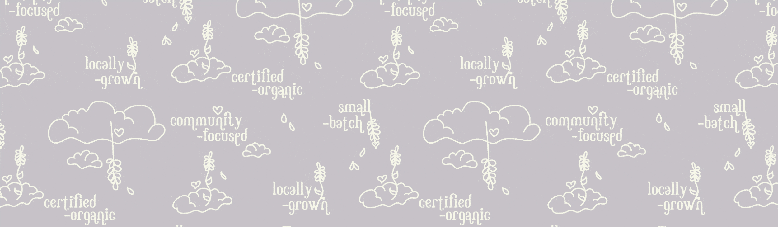

The earthy, pastel color palette paired with botanical + cloud illustrations communicate “natural coziness” and feel relaxing, comfy & organic.
The lines of all the illustrations & much of the typography have rounded edges to further contribute to an overall soft, gentle & feminine feel for Soft Meadows.
