
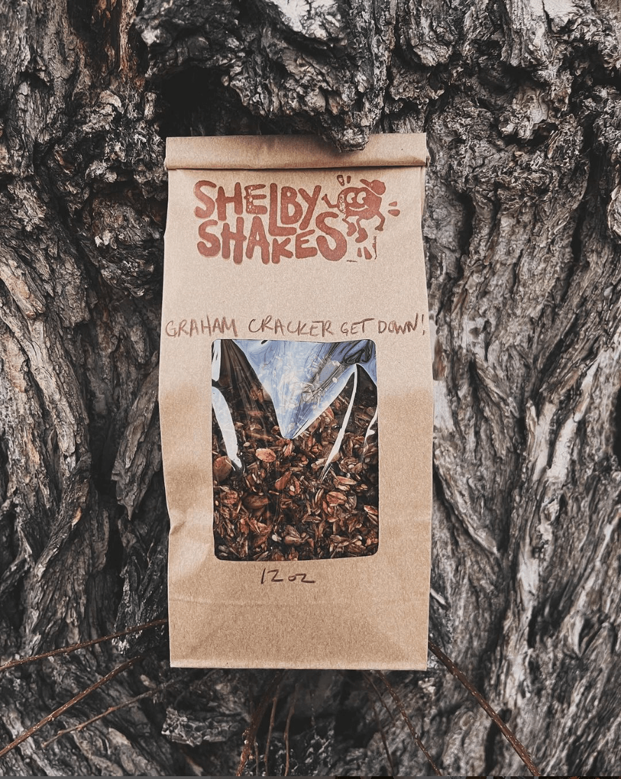
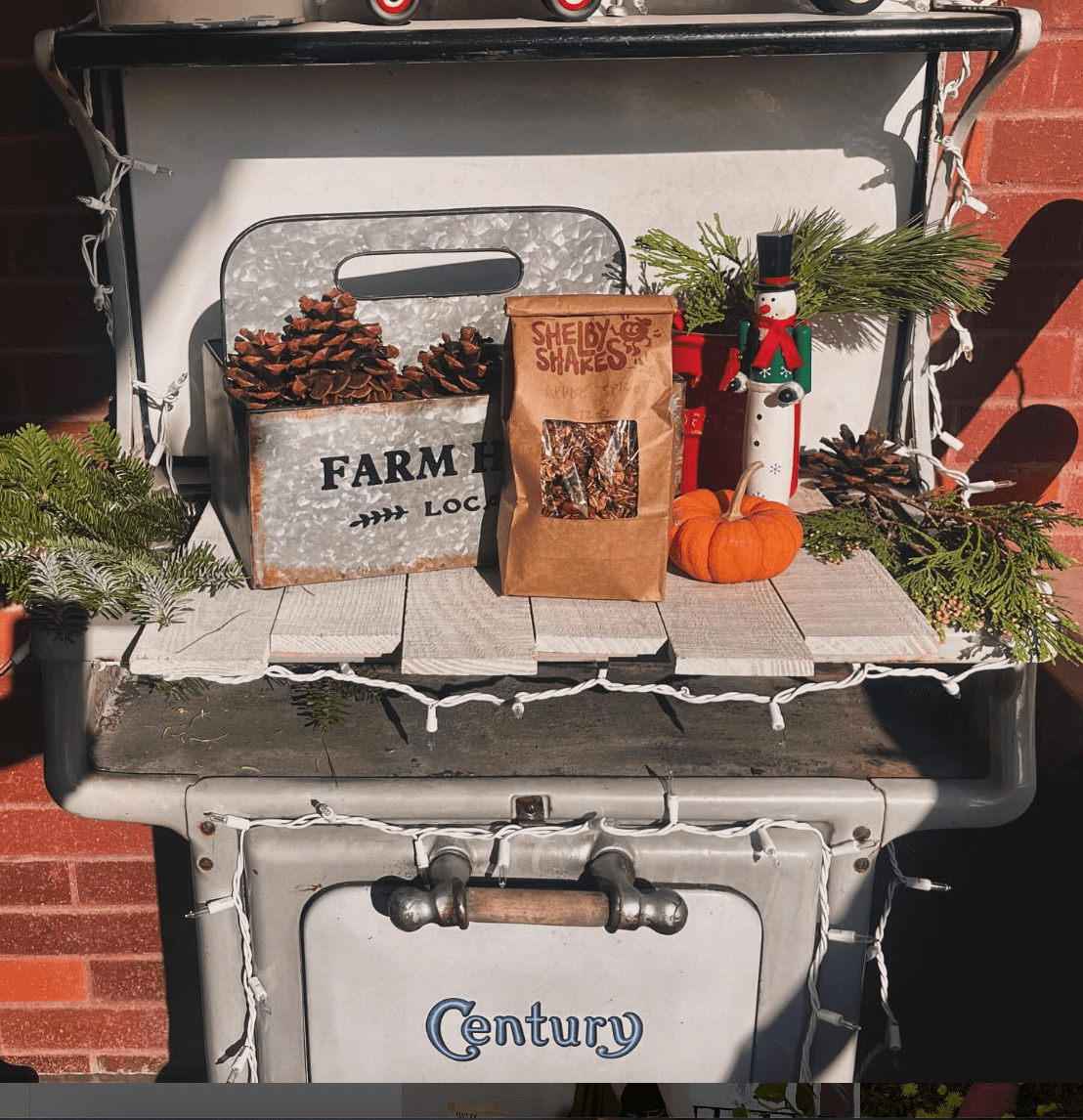
Shelby Shakes Granola
SERVICES: branding, illustration, packaging design, marketing collateral, character drawing
BRAND FEEL: creative, adventurous, playful, unique, organic, vibrant, approachable
PROJECT GOAL: Bring to life a logo design for Shelby Shakes that has a lot of character, will begin to build brand awareness, & can later be expanded upon into a more fully-flushed brand identity. Create this logo in time for holiday markets, to be created into a stamp & pressed onto packaging. Find an option for product packaging that will be eco-friendly, affordable & help the granola stay fresh.

Design & Strategy
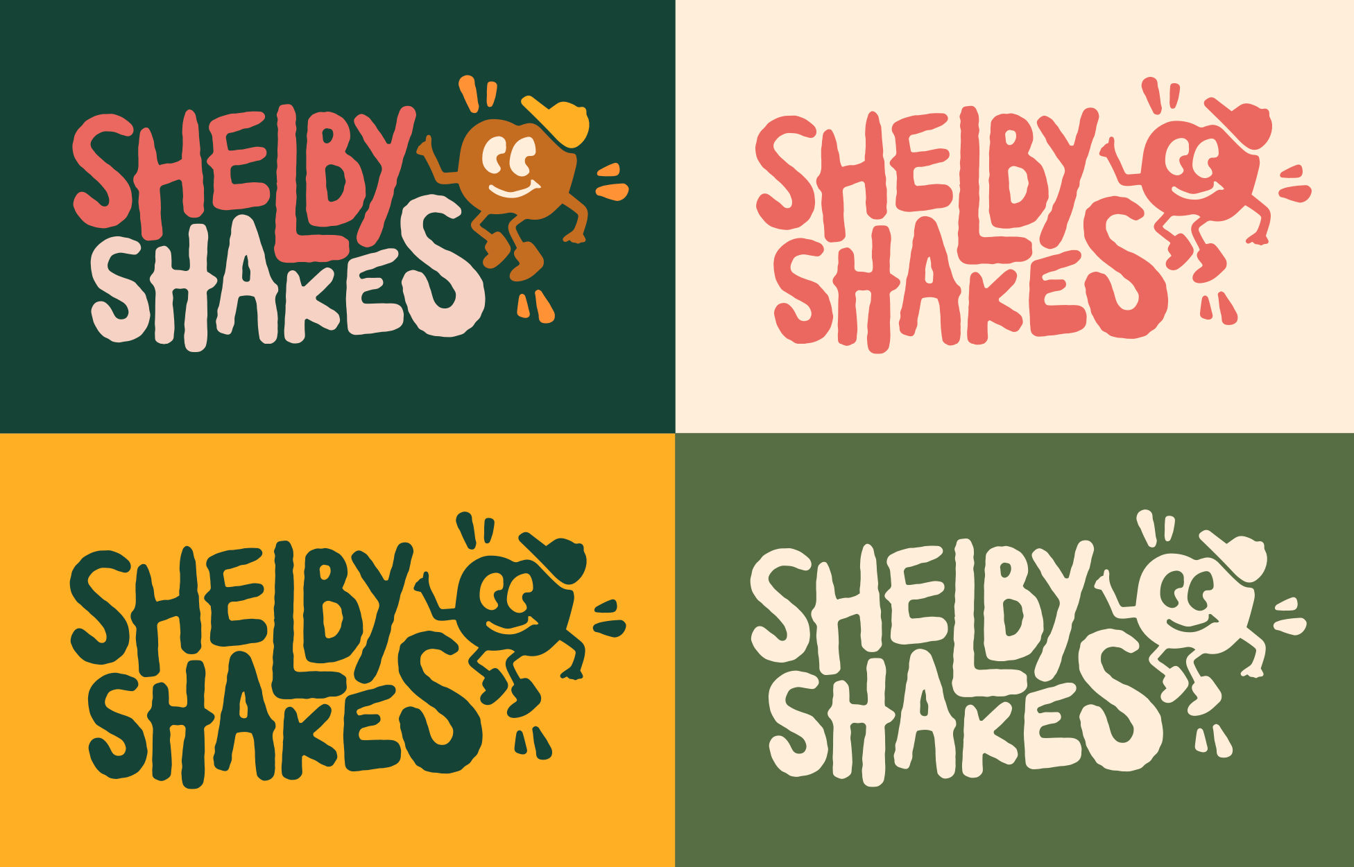
When designing Shelby Shakes, I wanted to make sure this brand evoked feelings of adventure, playfulness, natural/organic, vibrant, uniqueness & approachability.
The shapes and fonts included all give a natural & playful effect while maintaining professionalism and put-togetherness.
The character created for the brand adds a sweet touch of memorability + approachability.
The colors selected support the over feeling of vibrant yet natural.


The Story Behind the Character
Shelby Shakes Granola has a secret ingredient that is just one of many contributors to their zero waste mission: aquafaba.
If you don’t already know what that is, it’s the byproduct of cooking dried chickpeas - the liquid that remains after cooking, which acts at the perfect “glue” for many baking projects, including granola.
To create a wink towards Shelby Shakes’ zero waste efforts and a brand character that sparks conversation & curiosity, I hand-drew this dancing chickpea character, who has become the icon of this playful brand.
